
There’s something so comfortable and charming about using gold in decor that I am completely drawn to. Whether it’s a bold statement or a subtle accent, it just seems to elevate any space.
But I have to admit, it took me a few tries to figure out the perfect pairings. I’ve finally cracked the code, so today I wanted to share with you the easiest way to make gold shine in your home with these stunning color combinations.
Blue

I absolutely adore the way blue and gold come together to create a look that is just so stylish. If you take a peek at a color wheel, you will notice that shades of blue sit right across from the gold, orange, and yellow families.
There’s a reason for that! Colors opposite each other are called complementary, and it’s because they look so fantastic together. Since gold is basically a metallic yellow, it works so beautifully against blue.

Honestly, pretty much any shade of blue and gold will look amazing, but choosing just the right pairing is what can really take your design to a whole new level.
I think pale pastels, like a sweet robin’s egg blue or a classic Tiffany blue, look so sophisticated next to a more muted champagne gold.
For those more saturated shades like royal blue or lapis, a bolder and brassier gold is the perfect complement.
Green

I know some people worry about using trendy colors, thinking their decor will feel dated in a few years, but green is one of those colors that feels so fresh right now and is also completely timeless.
There’s something so charming about the whole cottagecore look that I am completely drawn to. It’s all about embracing a simpler lifestyle and bringing nature inside, which suits our family perfectly.
You might see this come to life with nature inspired greens like celery and sage, tons of live plants, and sweet vintage floral patterns.
A touch of gold in an antique picture frame or a whimsical birdcage would be just the right accent in a space like this.

But that’s not the only way to go! You can take green and gold in a much more lush and lavish direction too. Jewel tones look so luxurious with hints of gold. I love the idea of bringing in natural elements in an abstract way.
You could look for a statement piece like a big agate print area rug or some marbled green wallpaper with metallic gold veins running through it. To finish the look, an emerald velvet tuxedo couch with an extravagant gold and crystal chandelier would be a total showstopper.

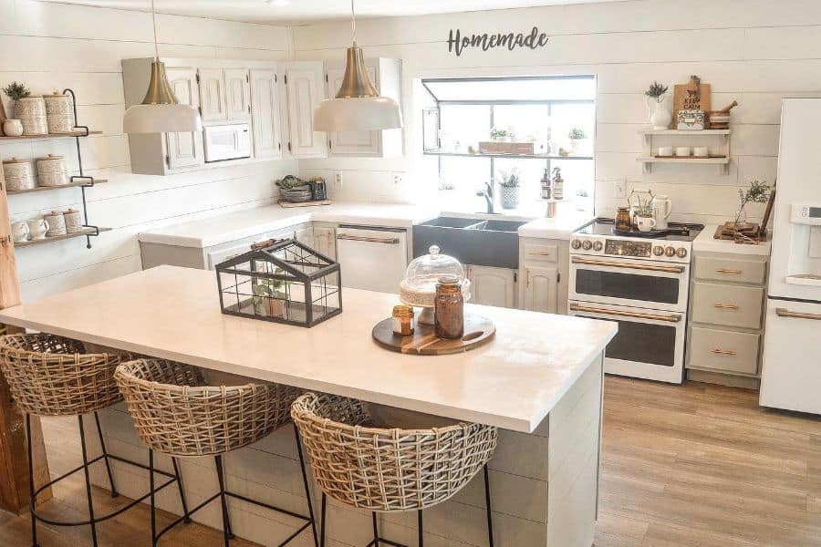
Black and White

Can we talk about how classic this combination is? Black and white together with gold is just so elegant. Using colors with high contrast is such a simple but effective way to create a dynamic look in a room.
While I love how graphic black and white is, I have to admit it can sometimes feel a little stark if it’s not styled just right. The secret is adding gold! It instantly makes the space feel more accessible and inviting.

This color scheme is a winner in my book for rooms with lots of hard surfaces, like a kitchen or a bathroom. For a modern take, I picture sleek black cabinets paired with a waterfall kitchen island wrapped in Calacatta marble.
Oh my gosh, that marble is identifiable by its unique gold veins and it is just gorgeous. If you’re looking for a more budget friendly option, you can always look for Calacatta quartz.

Cream

You guys, if you have ever tried to pick a white paint, you know there are thousands of shades to choose from. It can be a little overwhelming! The tiny variations in pigmentation are what make each one unique.
White paints can be sorted into three groups: true whites, warm whites, and cool whites. True whites have no undertones at all. Warm whites have those slight red, yellow, or brown undertones that give off a super cozy vibe.
Cool whites have hints of blue, gray, or green and feel more crisp and fresh.

Both ivory and cream are considered warm whites because of their yellow undertones, but they are different from each other. Ivory’s subtle undertones keep it closer to a true white, while that rich, buttery cream is getting closer to yellow on the color spectrum.
Since it is such a warm color, I think it’s best to balance cream with a more understated metal, like a beautiful rose gold.

Red

It is undeniable that red is a color that grabs your attention. A little bit can go a long way, which is why I find it’s most often used as an accent to add a pop of color to a room with more neutral tones.
Because it has a long wavelength, red is one of the most visible colors.

Now, there are ways to use red as the main color in your design, but you will probably want to stay away from the brighter shades like scarlet or candy apple red. Instead, I would choose deeper shades that have pink or brown undertones, such as rust, burgundy, or Venetian red.
Because red has a stimulating effect, it is probably best not to use this hue in places like the bedroom where you want to feel more relaxed.
It is also known to increase appetite, which makes it a great choice for the kitchen. Brick red cabinets are the perfect foil for some coppery gold cookware.

Ivory

To me, white and ivory might seem almost the same at first glance. But when you look at them side by side, you start to see the differences.
Those subtle yellow undertones are what help ivory feel so soft and warm against the bright, crisp hue of a pure white. We know that people tend to associate certain colors with emotions, and in recent years, ivory has become super popular with brides for their wedding gowns.
So it’s fitting that ivory is often associated with romance. It can also be seen as a bit old fashioned, maybe because of the way paper and vintage clothes can yellow over time.

Because ivory is such a neutral shade, it can be a fantastic foundation for more opulent and over the top decor. I think this color combination is perfectly suited for a French Regency style, which features highly ornamental furnishings.
Pieces like an elaborately carved Cabriole style sofa with ivory upholstery and an antique gold finish would be stunning.

Orange

Along with pink, orange is one of those colors you don’t see as often in interior design, at least not in the Western world.
I think people tend to associate it with garish things like traffic cones, but this playful color can be capable of so much beauty. I mean, the annual autumn spectacle of leaves changing color would be a lot less impressive without all that orange!

We can definitely take some inspiration from nature when we’re designing with orange. Painting your walls in an ombre style is such a clever way to create a sunrise experience every single day.
You would want to choose a whole array of hues from across the orange spectrum, like sherbet, creamsicle, and pumpkin. Then you would apply them to the wall from light to dark, starting with the palest color on top and using a gradient technique so each hue blends into the next.
An overdyed orange area rug would perfectly complement these walls. To finish it off, you could find some quirky thematic decor, like vintage brass crane figurines. Just charming!

Gray and White

For a look that feels both cozy and contemporary, you really can’t go wrong with gray, white, and gold.
Other neutral colors like beige and taupe have an earthiness that doesn’t appeal to everyone, so I find that gray is an ideal alternative for people looking for a smarter, more sophisticated neutral tone.
I think many people find that a gray, white, and gold color scheme hits that perfect medium between homey and high end. Gray and white are both so soothing and serene, while gold adds just the right touch of glitz.

This combination works particularly well in a living room. I can just picture a gray area rug with a metallic gold geometric pattern playing beautifully off of a gray and white marble fireplace.
You can also use other decorative accents to bring in those touches of gold. A round, gold rimmed mirror and a brushed brass drum chandelier really embody that modern glam style. So beautiful.

Purple

For a long time, the color purple has been associated with royalty and power. For centuries, purple dye was so rare that only the wealthiest people could afford it.
It became even more exclusive in the late sixteenth century when Queen Elizabeth I decreed that only members of the royal family could wear purple. Isn’t that wild?

As such a versatile and timeless color, purple is a beautiful option when you’re decorating your home. It can be a bold color, but it can also easily overtake a space.
To avoid this, I would select paler purple shades like lavender or periwinkle for your color scheme. I think these pastel hues look so lovely when they are paired with a more muted champagne gold.
Black

Wow, what an incredibly chic color combination! Black and gold together make for such a bold and stylish statement in any room.
Metallic colors like gold have this innate elegance, while dark colors like black have a sleek and trendy feel. When they are paired together, the combination is a luxurious modern look that will elevate your space.
 When I work with this color scheme, I usually use black as the dominant hue and keep gold as an accent.
Too much gold can sometimes come across as a bit gaudy, so using it sparingly keeps the design feeling more tasteful. Because black and gold are such a timeless duo, they can be incorporated into all sorts of design styles.
In a modern minimalist dining room, you could offset matte black walls with a brushed gold pendant light. Or, if your tastes lean more towards maximalism, you could deck out a powder room with textured faux crocodile wallpaper and an ornate gilt rococo mirror.

Pink

Did you know that pink is one of the least used colors in interior design? I think people sometimes steer away from it because they associate it with being frilly or fussy.
What many people don’t realize is that until the 1940s, pink was actually viewed as a masculine color. But regardless of gender, I believe pink can pack a powerful punch in the right hands.
Shades can range from the palest rose to the deepest magenta, and different undertones just increase the diversity of this palette. This versatility gives you so many options to explore when decorating.

I think pink can look particularly chic as part of a monochromatic color scheme, which is one of the leading trends right now. In a monochromatic room, you would choose a single base color and then use it throughout the space in a variety of tones and textures.
I can just imagine pairing plush upholstered chairs in a blush colored velvet with gleaming rose gold end tables for a resplendent reading room. Just gorgeous!
Taupe

Taupe is such a stylish neutral color that offers a really warm and cozy vibe. Both warm and cool taupe shades can pair beautifully with gold to design a classic and upscale feel in your home.
I know people frequently use beige and taupe interchangeably when describing colors. While both are neutral, they have some marked differences.
Beige is best described as a pale sandy brown with warm yellow undertones. Taupe is what you get when gray is mixed with beige.

The gray darkens the taupe a bit, so it has more of an earthy vibe. You can frequently see taupe on the walls of apartments and other rental properties because landlords gravitate towards neutrals that appeal to a lot of people.
The downside is that this color can sometimes come across as a little drab. That’s where gold comes in! Incorporating gold accents in picture frames, accent tables, and decorative pillows can bring a bland taupe to life.

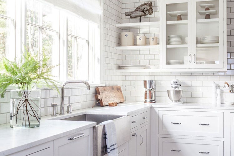
White

There is something so soothing about white and gold. This bright and airy color combination can make any room feel elegant and ethereal. I have always loved using white in interior design for so many reasons.
As a neutral shade that can be matched with basically any other color, its versatility is just unparalleled. White is the most reflective hue on the color spectrum. All other colors absorb light to some extent, but white reflects it right back.

Using white as a base color in your room instantly makes any space feel larger and brighter. Adding in some gold accents further enhances white’s reflective qualities.
The union of white and gold can be incorporated into nearly any style of interior design. For an all white kitchen, adding gold accents like drawer pulls, faucets, and pendant lights can make the space feel contemporary with a hint of glam.
In a bathroom, you could consider using all gold fixtures and gilt edged Moroccan fish scale tiles to create a spa like environment. Heaven!

Brown

The color brown is often unfairly seen as drab or boring, but I think certain shades have an alluring earthiness that is just irresistible. I love that many brown hues are named after tasty treats, which proves this color can be downright delectable.
Brown has an inherent richness that is only enhanced when it is paired with gold. I think this color combination is especially effective in a bedroom if you want to create a space that is as soothing as it is sophisticated.

People often think of brown as a manly color, and it is incredibly well suited for a moody, masculine bedroom.
Deep chocolate brown walls make a wonderful backdrop for a caramel colored tufted headboard crafted out of buttery leather. To complete the look, I would add a modern brushed gold suspension chandelier. Just gorgeous.